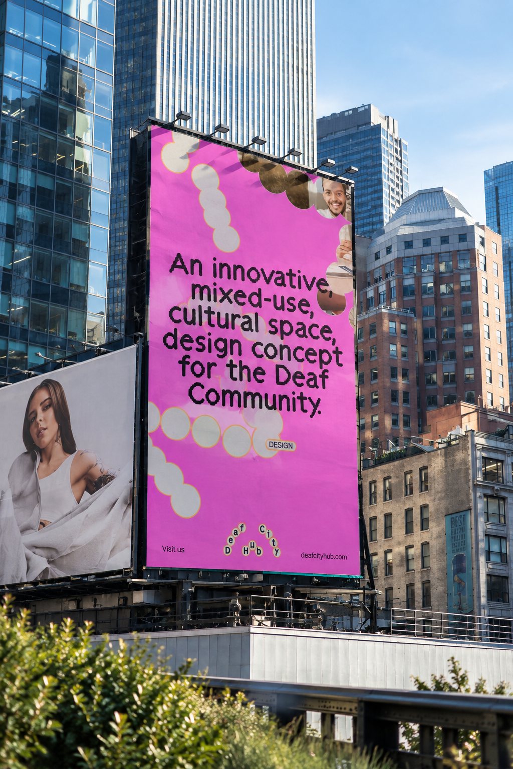
DeafCity Hub logo made from BSL motion
Templo captured BSL hand movements to build DeafCity Hub’s logo and visual system — a motion-first identity that puts deaf communication at the centre.
What happened and why it matters
Design studio Templo has built the visual identity for DeafCity Hub from the movements of real hands signing in British Sign Language. Instead of borrowing a ready-made typeface, the team tracked signing gestures, translated their shapes into bead-like letterforms, and kept the slight wobble of human motion rather than smoothing it away. The result is a logo and motion system that foregrounds deaf communication as the brand’s starting point — not an add-on.
How the identity works
Letters sit inside a chain of rounded, organic circles and carry the rhythm of gesture. Templo used motion-tracking technology to capture the signing shapes, then built the type-like forms and supporting graphics from those recordings. The design deliberately preserves minor irregularities so the identity feels lived-in and tactile, not mechanically perfect.
Colour is another deliberate choice. The palette pairs hot pink with bright orange — a loud, high-energy combo chosen to stand out against other deaf-led and charitable brands that often favour muted tones. In practice, that palette reads like flyer or nightlife graphics, which helps DeafCity Hub feel contemporary and unapologetically visible on posters, social posts and venue signage.
Voice from DeafCity Hub
"Movement, 3D spatial language, and visual rhythm are at the heart of deaf culture and communication." — Amanprit Arnold
Why music and culture fans should care
For anyone who goes to gigs, co-working nights or community events, a venue’s visual identity shapes how you recognise and remember it. DeafCity Hub’s motion-first branding is built to animate across screens and live settings, giving the space a distinctive presence in line-ups, posters and stage visuals. More broadly, it’s a reminder that branding can be an act of cultural translation — starting from how a community communicates, not how a designer imagines it.
Key takeaway
Templo’s approach flips the usual design process: start with people, not pixels. The identity’s motion capture of BSL gestures and its bold colour choice make DeafCity Hub visually immediate and authentically grounded in deaf culture.
Something wrong on this page? Tell us and we will fix it.