Instagram’s New Wordmark Divides Creatives
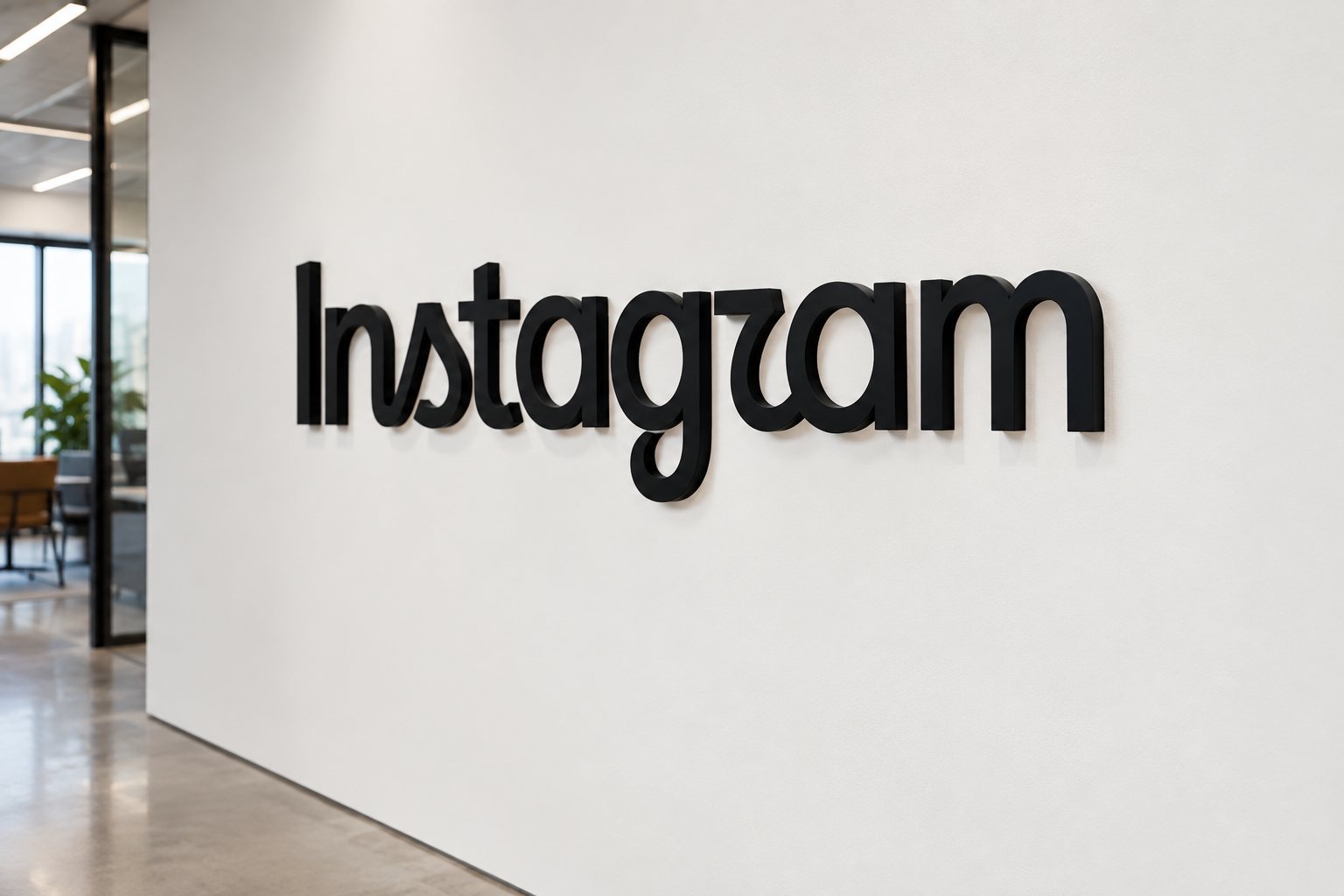
Instagram rolled out a new wordmark and visual system on 2026 - 08 - 19; designers are divided, and the change affects creators and how music is shown online.
Instagram unveiled a refreshed wordmark and an expanded visual system on 2026-08-19, and the design choices have split creative opinion. For musicians and music fans, the argument isn’t just about aesthetics: it affects branding, discoverability and the visual tone artists use to present music online.
What changed
The update includes a new hybrid wordmark that blends handwritten and geometric letterforms, plus two new typefaces named Instagram Pen and Instagram Mono, revised sans-serifs, and tweaks to motion, layout and spacing across the app. The wordmark is the most visible change, but it’s meant to sit inside a broader ecosystem rather than function as a standalone emblem.
Why designers are arguing
Reactions fall into two camps. Some designers welcome the move away from the ubiquitous clean sans-serifs of the last decade, saying the script nods to personality and creative heritage. As art director Alastair McCarley puts it, "I love it," he enthuses.
Others object on legibility and inclusivity grounds. Brand designer Sophie O’Connor called the pairing of type styles uneasy, noting specific letterforms that read oddly at small sizes. Designer Berenice Howard-Smith raised accessibility concerns, arguing that reduced clarity can exclude viewers who rely on straightforward letterforms. Senior lecturer Graham Jones suggests context matters — people read whole words, not single letters — but that doesn’t entirely settle the debate.
Why music creators should care
- Branding: Artists use Instagram wordmarks, profile graphics and merch mockups; a new wordmark shifts the baseline for what looks current and credible.
- Readability: Tour dates, ticket links and collaborator tags often appear in small type; changes that hamper legibility can affect engagement and conversions.
- Tone: The visual language Instagram adopts nudges how artists frame releases — more analog warmth or a cleaner, tech-forward look will subtly shape artwork and promos.
The split over Instagram’s update ultimately surfaces a larger question: should a platform with massive equity be allowed visual leeway other brands can’t afford? The answer matters because Instagram’s design choices ripple through how music is packaged and promoted. Whether you love the new wordmark or hate it, the practical effect is the same: artists and their teams will need to test how the refreshed system performs across profiles, posters and pixels.
Something wrong on this page? Tell us and we will fix it.