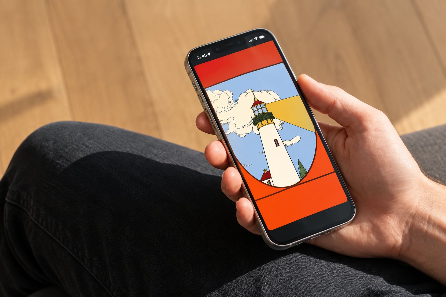
Keen rebrand by María Jesús Contreras
María Jesús Contreras illustrated Keen's rebrand, out 2026-09-10. Mother Design swaps minimalist wellness for folk art - music fans will spot festival-ready visuals.
María Jesús Contreras illustrated Mother Design’s rebrand for psychic platform Keen, released 2026-09-10. The studio has recast the service as a wellbeing brand that leans into folk art, colour and human stories rather than the quiet, pared-back aesthetic that dominates wellness design.
What changed — fast
Instead of pale palettes and white space, Keen now wears a lively mix of grounding tones and optimistic accents, expressive serif type paired with a humanist sans, and layered illustrations that blend city life, countryside scenes and spiritual symbolism. The idea is to make psychic guidance feel like everyday support—clarity and perspective you can use—rather than a prediction you consult only in a crisis.
"Wellness has become surprisingly uniform," — Jo Tulej, creative director at Mother Design.
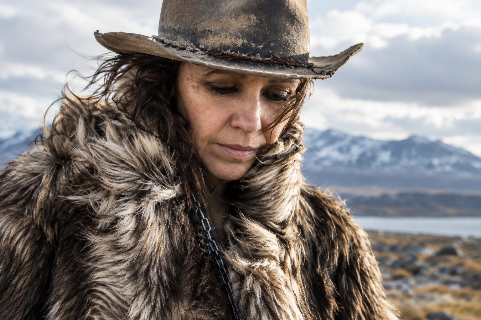
Illustrator María Jesús Contreras provides the visual heart of the new identity: detailed, folk-art-inspired scenes that function as a living system rather than a static set of assets. Circular motifs, shifting viewpoints and warm photography of real advisors are used to humanise the platform across website, app and social channels.
Why music fans should care
This isn’t just a branding pivot for a niche service—it's a push toward a visual language that overlaps heavily with music culture. The maximalist, hand-drawn look is immediately readable to anyone who follows festival art, band merch or independent label aesthetics. Expect this style to ripple into poster art, stage backdrops and merch design where warmth, human touch and a slightly psychedelic palette sit comfortably with contemporary indie and electronic scenes.
For artists and promoters, Keen’s refresh is a reminder that audiences now favour personality and narrative over slick uniformity. If you care about album sleeves, festival identity or the visual tone of a tour, the methods Mother Design used—folk motifs, tactile colour, and illustrating real people—are a short cut to authenticity that plays well on screens and merch tables alike.
The new identity is rolling out across Keen’s digital channels now, offering a festival-ready aesthetic that pairs ancient symbolism with a modern, approachable voice.
Something wrong on this page? Tell us and we will fix it.