Rob Farmer — NYT Book Review, 2026-09-17
Rob Farmer's NYT Book Review illustration (2026-09-17) shows how fast sketches and procedural motion techniques are remaking editorial and music visuals.
Rob Farmer — New York Times Book Review illustration — 2026-09-17. If you care about the visuals that surround music — album art, video idents, magazine layouts — Farmer’s low-friction approach is worth watching: rough ideas, an Instagram queue and procedural software produce finished work fast enough to meet editorial deadlines.
Why music fans should look up from the playlist
Farmer’s method matters because the same techniques that inform magazine covers and editorial illustrations also feed into music visual culture. Quick, pattern-driven motion and bold editorial shapes are the language of modern album campaigns and video treatments; the way Farmer turns a five-minute sketch into a publishable image shows how visuals can stay spontaneous without sacrificing craft.
How he actually works
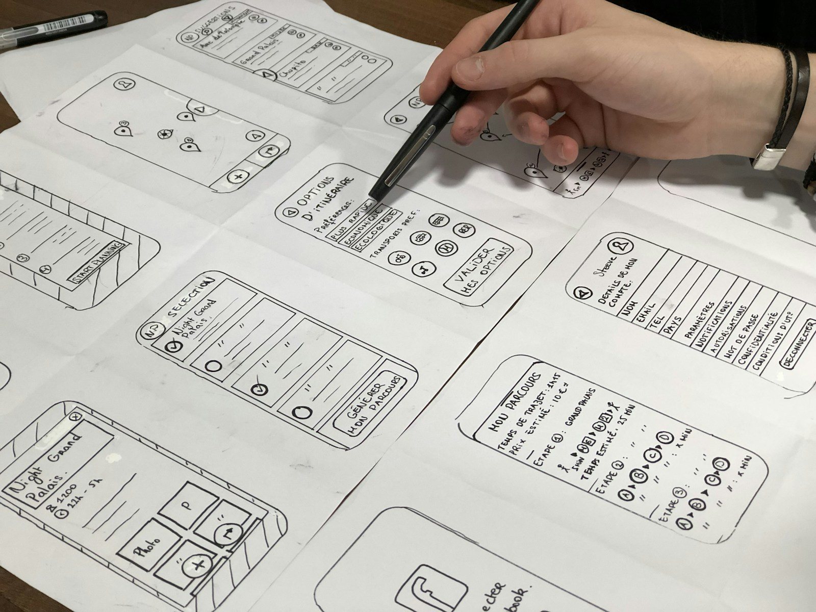
Raised in Geelong and starting university at 27 after "a lot of gap years" — including time in London and a ski season in Utah — Farmer learned the value of experimentation. An early internship in Brooklyn pushed him to carve out a parallel stream of personal work. He sketches fast, screenshots ideas into an Instagram planning app and lets an unfinished queue act as a visual library that can be pulled into briefs.
For making, he leans on the Cavalry App and procedural tools: noise, randomisers and parameters that mimic patterns found in nature. Those digital controls let him translate gestures from walks, flocking birds or TV static into repeatable visual systems — useful when a client needs a distinct yet flexible look on a tight schedule.
“You can look at anything around you and wonder how you could interpret this in design or motion,” says Rob Farmer.
From an em-dash tattoo to magazine covers
One recent piece began as a loose sketch for a New York Times Book Review illustration about AI and the em-dash, commissioned by Matt Dorfman. That bit of loose thinking grew into other commissions — including a New York Times Magazine cover and work for the Design Museum’s Future Observatory Journal — examples of how a small, shareable idea can scale into high-profile editorial work.
Farmer’s practical takeaway is simple: keep making, share the rough stuff and don’t let perfectionism hide useful ideas. For listeners who notice the hand behind a record sleeve or the motion in a promo clip, his process is a reminder that great visuals often start half-baked.
Something wrong on this page? Tell us and we will fix it.