The Train Factory's new identity
A carriage lifting mark becomes The Train Factory's T logo, tying signage, colour and motion to the red-brick halls and the venue's cultural reboot.
Hasan & Partners unveiled The Train Factory's new identity on 2026-09-08. The Helsinki venue — a converted locomotive works in Vallila now home to restaurants, theatre and galleries — gets a brand rooted in the building itself.
From maintenance mark to main sign
The designers started with a small, functional detail: a lifting symbol stencilled on the side of a train carriage, once used to show where to lift a wagon during maintenance. Hasan & Partners reworked that utilitarian mark into a clean, geometric 'T' that reads as both a letter and a platform-lift motif. Its angles echo the triangular skylights and gabled roofs that shape the interior.
Materials that speak the site's language
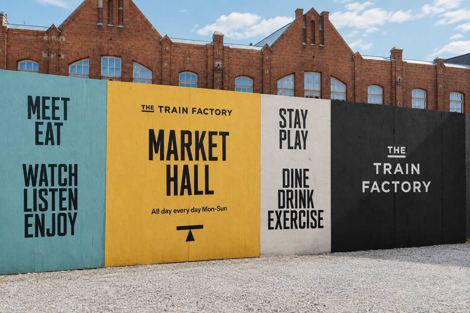
Typography and colour are chosen from the depot's own vocabulary. The logotype nods to Finnish train-car numbering styles and pairs with a heavy industrial headline face for signage. The palette is lifted from the site: red brick walls, the yellow of original factory markings and cranes, and a grey-blue used across wayfinding.
Motion is part of the system too: on-screen animation references the mechanical announcements of old stations, letters dropping into place like flipboard signs. The identity is already rolled out across wayfinding, brand communications, social and a new website, giving the site a consistent face as it ramps up cultural programming.
“The result brings the legacy of the site back to life with a brand that references its industrial past through a new, lively attitude,” Hasan & Partners says.
The studio kept play minimal — the chosen tagline is the single railway pun: 'Your Next Stop' — and let the building do most of the talking. Photography by Henri Vogt captures the brick, glass and iron that informed the choices.
For music and culture fans, the new identity matters because it clarifies what The Train Factory now offers: a coherent, legible destination where historical character supports contemporary programming. The branding makes the place easier to navigate, promotes a stronger sense of place and signals that the venue is ready for a busy cultural timetable.
Something wrong on this page? Tell us and we will fix it.